
Build Your Own Stock Charts with Yahoo Finance API and Python
Are you into stock trading? Then stock quotes and charts are no strangers to you. But if you want to give yourself some edge in analyzing stock data, then coding up your stock chart isn’t that difficult if you have the data. Thankfully, there is also an API for that.
The Yahoo Finance API
Yahoo Finance is one of the reliable sources of stock market data. It supports market summaries, current and historical quotes, news feed about the companies and much more.
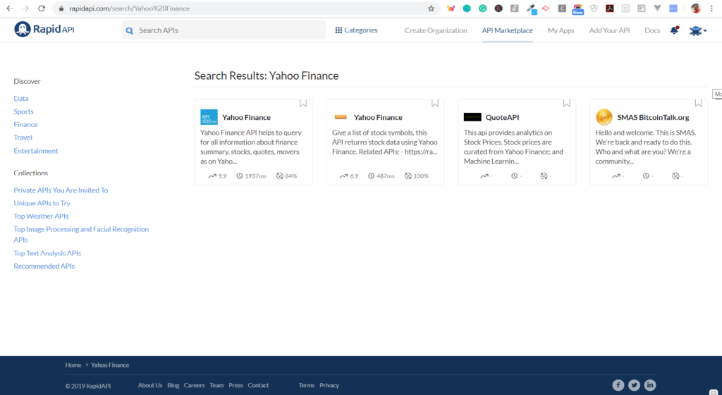
The unofficial Yahoo Finance API is available on RapidAPI.
How to get Access to Yahoo Finance API
1. Sign Up for a RapidAPI User Account
To begin using the Yahoo Finance API, you'll first need to sign up for a free RapidAPI developer account.RapidAPI is the world’s largest API marketplace, with over 10,000 APIs and over 1,000,000 developers. Our goal is to help developers find and connect to APIs to help them build amazing apps.
2. Navigate to the Yahoo Finance API Page
Search for “Yahoo Finance” in the search bar, or click here to get there directly.
3. Subscribe to the Yahoo Finance API
Once you have successfully navigated to the Yahoo Finance page, click on the "pricing" tab and pick a pricing plan.Hint: Subscribe to the Basic Plan to get 500 free requests/month.
Now, let’s write some code to crunch the data.
How to use the Yahoo Finance API with Python
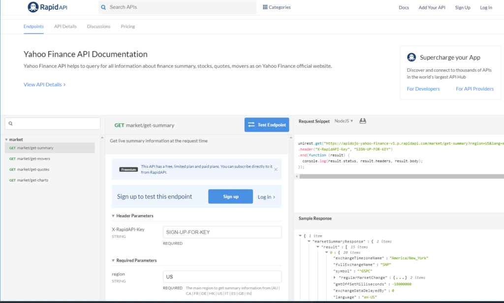
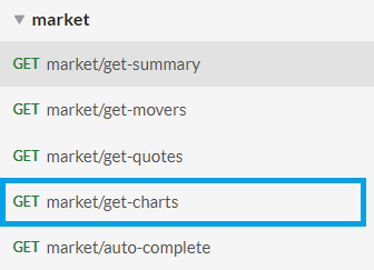
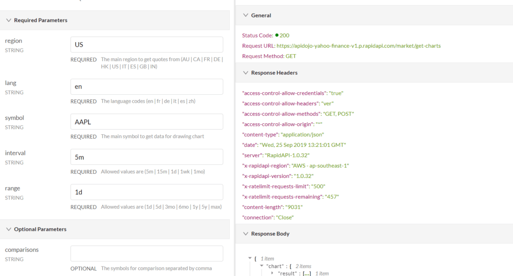
You will now learn how to build a stock chart app by creating a simple Python application that consumes the data from Yahoo Finance API. But before you get into the code, you must know which API endpoint to use.Take a look at the left side endpoint listing in the API console page of Yahoo Finance. You can see multiple endpoints, categorized into market and stock.

Since our goal is to build a stock chart with historical stock quotes, you must look for API endpoints that provide historical data. A closed look at the endpoint lists reveals that the Yahoo Finance API actually provides an endpoint for creating a chart.
Let’s test this endpoint. Invoking this API with the symbol AAPL( Apple Inc.) gives a series of data based on time range and interval.
That’s it!
This is all you need to build a basic stock chart. So the idea here is to extract the API response from the endpoint listed under market, parse it in a human-readable form and then plot it on a line chart.
To call this API with Python, you can choose one of the supported Python code snippets provided in the API console. Here is an example of how to invoke the API with unirest library.

How to Build Your own Personalized Stock Chart with Yahoo Finance API
Building the stock chart app is a fun and easy way to interpret data obtained from APIs. So let’s get started with the coding now. Follow along with the steps below to build your own stock chart from Yahoo Finance API using python.But first, you have to set up the programming environments with the requisite tools and libraries that we will be using in this app.
Prerequisites
Here is what you need in terms of the Python runtime.
- Python 2.7
- Pip ( any recent version of pip that ships with Python 2.7)
Libraries
Seaborn
Seaborn is a Python visualization library that works on top of the popular matplotlib. This will render the data and display it as a chart.To install seaborn, run the following command within your Python 2.7 runtime
pip install seaborn
Unirest
unirest is a lightweight HTTP library. You will use this to invoke the Yahoo Finance API endpoints.
To install the Python version of this library, invoke the pip command as follows
pip install unirest
Pandas
Pandas is a data analysis library for Python. It is used to prepare and hold the time series data returned from the Yahoo FInance API. It is the default choice of data storage buffer for Seaborn.
pip install pandas
It’s a good idea to fire up your favorite Python code editor and create a new file. So follow the step by step instructions below to add the code.
1. Import the Libraries
First up, you need to import the python modules that are used in this app.
Here is the list of all imports:
import seaborn as sns
import matplotlib.pyplot as plt
import pandas as pd
from datetime import datetime
import unirest
from matplotlib import rcParams
You will understand the significance of each of the imported modules in the later steps. For now, let’s just moves onto the next step.
2. Initialize the Global Data
You need to define some global data to store configurations as well as transient data. Extend the code below the import statements with these global declarations.
unirest.timeout(15) # 5s timeout

RAPIDAPI_KEY    = "<YOUR_RAPIDAPI_KEY>"
RAPIDAPI_HOST = "<YOUR_RAPIDAPI_ENDPOINT>"

symbol_string = ""
inputdata = {}
Don’t forget to replace the placeholders <YOUR_RAPIDAPI_KEY> and <YOUR_RAPIDAPI_ENDPOINT> with your own subscription specific values displayed on the API console.
3. Call the API to Fetch Chart Data
You have already tested the ‘/chats’ endpoint of the AP manually. Let’s define the API call using the Python unirest library.
def fetchStockData(symbol):

  response = unirest.get("https://apidojo-yahoo-finance-v1.p.rapidapi.com/market/get-charts?region=US&lang=en&symbol=" + symbol + "&interval=1d&range=3mo",
    headers={
      "X-RapidAPI-Host": RAPIDAPI_HOST,
      "X-RapidAPI-Key": RAPIDAPI_KEY,
      "Content-Type": "application/json"
    }
  )

  if(response.code == 200):
    return response.body
  else:
    return None
This API call fetches the stock quote for every single day (trading day) during the last three months, for a given stock symbol. The stock symbol is taken in as an argument and it will be taken in as user input.
4. Parse the API Response
This API returns a lot of data for a stock symbol. All of it is formatted as a separate time series of opening, closing, high and low figures of the stock during each day.
You can choose to display them all but for the sake of keeping the chart uncluttered, we have considered only the opening and closing figure of the stock during each day.
Here is how you will parse the timestamp:
def parseTimestamp(inputdata):

  timestamplist = []

  timestamplist.extend(inputdata["chart"]["result"][0]["timestamp"])
  timestamplist.extend(inputdata["chart"]["result"][0]["timestamp"])

  calendertime = []

  for ts in timestamplist:
    dt = datetime.fromtimestamp(ts)
    calendertime.append(dt.strftime("%m/%d/%Y"))

  return calendertime
You have to create the timestamplist twice, one for the opening figures of the stock symbol and then for the closing figures of the stock symbol.
Now, for extracting the opening and closing values, here is the function to do that.
def parseValues(inputdata):

  valueList = []
  valueList.extend(inputdata["chart"]["result"][0]["indicators"]["quote"][0]["open"])
  valueList.extend(inputdata["chart"]["result"][0]["indicators"]["quote"][0]["close"])

  return valueList
We need to have one more step to define the “open” and “close” event. Let’s define one more function for that.
def attachEvents(inputdata):

  eventlist = []

  for i in range(0,len(inputdata["chart"]["result"][0]["timestamp"])):
    eventlist.append("open")

  for i in range(0,len(inputdata["chart"]["result"][0]["timestamp"])):
    eventlist.append("close")

  return eventlist
With this, you have all the parsing routines for arranging the data in a form suitable for charting.
5. Extract and prepare the data in a Pandas Dataframe
You can now extend the Python program to define the main block. At first, you will take the user input for the stock symbol and call all the routines described above to extract the data and prepare it in a Pandas Dataframe.
while len(symbol_string) <= 2:

        symbol_string = raw_input("Enter the stock symbol: ")

retdata = fetchStockData(symbol_string)

if (None != inputdata):

        inputdata["Timestamp"] = parseTimestamp(retdata)

        inputdata["Values"] = parseValues(retdata)

        inputdata["Events"] = attachEvents(retdata)

        df = pd.DataFrame(inputdata)
The Pandas Dataframe structure is somewhat like this sample format:
| Timestamp | Values | Events |
|---|---|---|
| 06/26/2019 | 23.4 | open |
| 06/27/2019 | 24.7 | open |
| 06/26/2019 | 23.23 | close |
6. Plot the Chart
The Seaborn takes in the Pandas data frame as the input for the chart. You just have to define the charting call from the SDK and pass on the styling attributes for displaying the axis and labels.sns.set(style="darkgrid")You have to use thercParams[‘figure.figsize’] = 13,5
rcParams[‘figure.subplot.bottom’] = 0.2ax = sns.lineplot(x=“Timestamp”, y=“Values”, hue=“Events”,dashes=False, markers=True,
data=df, sort=False)ax.set_title('Symbol: ’ + symbol_string)
plt.xticks(
rotation=45,
horizontalalignment=‘right’,
fontweight=‘light’,
fontsize=‘xx-small’
)plt.show()
linplot() call to Seaborn for rending the chart as a line graph. Check the API reference for lineplot( ) function to understand how to use it.
You are now done. Here is the complete program in case you want to refer to it.
import seaborn as sns
import matplotlib.pyplot as plt
import pandas as pd
from datetime import datetime
import unirest
from matplotlib import rcParams

unirest.timeout(15) # 5s timeout

RAPIDAPI_KEY  = "<YOUR_RAPIDAPI_KEY>"
RAPIDAPI_HOST = "<YOUR_RAPIDAPI_ENDPOINT>"

symbol_string = ""
inputdata = {}

def fetchStockData(symbol):

  response = unirest.get("https://apidojo-yahoo-finance-v1.p.rapidapi.com/market/get-charts?region=US&lang=en&symbol=" + symbol + "&interval=1d&range=3mo",
    headers={
      "X-RapidAPI-Host": RAPIDAPI_HOST,
      "X-RapidAPI-Key": RAPIDAPI_KEY,
      "Content-Type": "application/json"
    }
  )

  if(response.code == 200):
    return response.body
  else:
    return None


def parseTimestamp(inputdata):

  timestamplist = []

  timestamplist.extend(inputdata["chart"]["result"][0]["timestamp"])
  timestamplist.extend(inputdata["chart"]["result"][0]["timestamp"])

  calendertime = []

  for ts in timestamplist:
    dt = datetime.fromtimestamp(ts)
    calendertime.append(dt.strftime("%m/%d/%Y"))

  return calendertime

def parseValues(inputdata):

  valueList = []
  valueList.extend(inputdata["chart"]["result"][0]["indicators"]["quote"][0]["open"])
  valueList.extend(inputdata["chart"]["result"][0]["indicators"]["quote"][0]["close"])

  return valueList


def attachEvents(inputdata):

  eventlist = []

  for i in range(0,len(inputdata["chart"]["result"][0]["timestamp"])):
    eventlist.append("open")

  for i in range(0,len(inputdata["chart"]["result"][0]["timestamp"])):
    eventlist.append("close")

  return eventlist


if __name__ == "__main__":

  try:

    while len(symbol_string) <= 2:
      symbol_string = raw_input("Enter the stock symbol: ")

    retdata = fetchStockData(symbol_string)


    if (None != inputdata):

      inputdata["Timestamp"] = parseTimestamp(retdata)

      inputdata["Values"] = parseValues(retdata)

      inputdata["Events"] = attachEvents(retdata)

      df = pd.DataFrame(inputdata)

      sns.set(style="darkgrid")

      rcParams['figure.figsize'] = 13,5
      rcParams['figure.subplot.bottom'] = 0.2


      ax = sns.lineplot(x="Timestamp", y="Values", hue="Events",dashes=False, markers=True,
                   data=df, sort=False)


      ax.set_title('Symbol: ' + symbol_string)

      plt.xticks(
          rotation=45,
          horizontalalignment='right',
          fontweight='light',
          fontsize='xx-small'
      )

      plt.show()

  except Exception as e:
    print "Error"
    print e
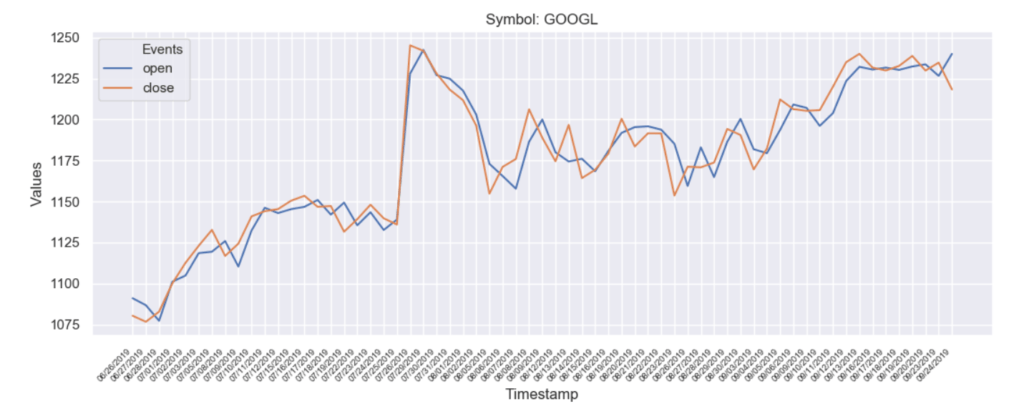
Check Out Your Favorite Stocks
The program is now ready, so why not take it on a test drive. Replace the placeholders with your RapidAPI specific subscription values and you are all set to try it out.
Here is a test run to chart the stock performance for Apple Inc. (Stock Symbol: AAPL)
[video width=“1796” height=“1080” mp4=“https://rapidapi.com/blog/wp-content/uploads/2019/09/yahoo-finance-python-chart.mp4”][/video]
Wrapping Up
Visualizations are a great way to consume data and this blog post shows you how to do it. But you have got the idea now, so why not explore more. Check out the complete documentation of Seaborn and you will get more ideas. Also, you can check out the individual stock endpoints of Yahoo Finance API to get more granular data about companies.We wish you good luck with your data exploration endeavors and hope to see some magnificent visualizations powered by RapidAPI.
Related Stock and Finance APIs
- Morningstar - Query major exchanges for common stock fundamentals, splits, dividends, daily prices and assorted metadata as per the Morningstar website.
- Quandl - The premier source for financial, economic, and alternative datasets, serving investment professionals. Quandl’s platform is used by over 400,000 people, including analysts from the world’s top hedge funds, asset managers and investment banks.
- Investor Exchange (IEX) Trading - The IEX API is a is a free, web-based API supplying IEX quoting and trading data.